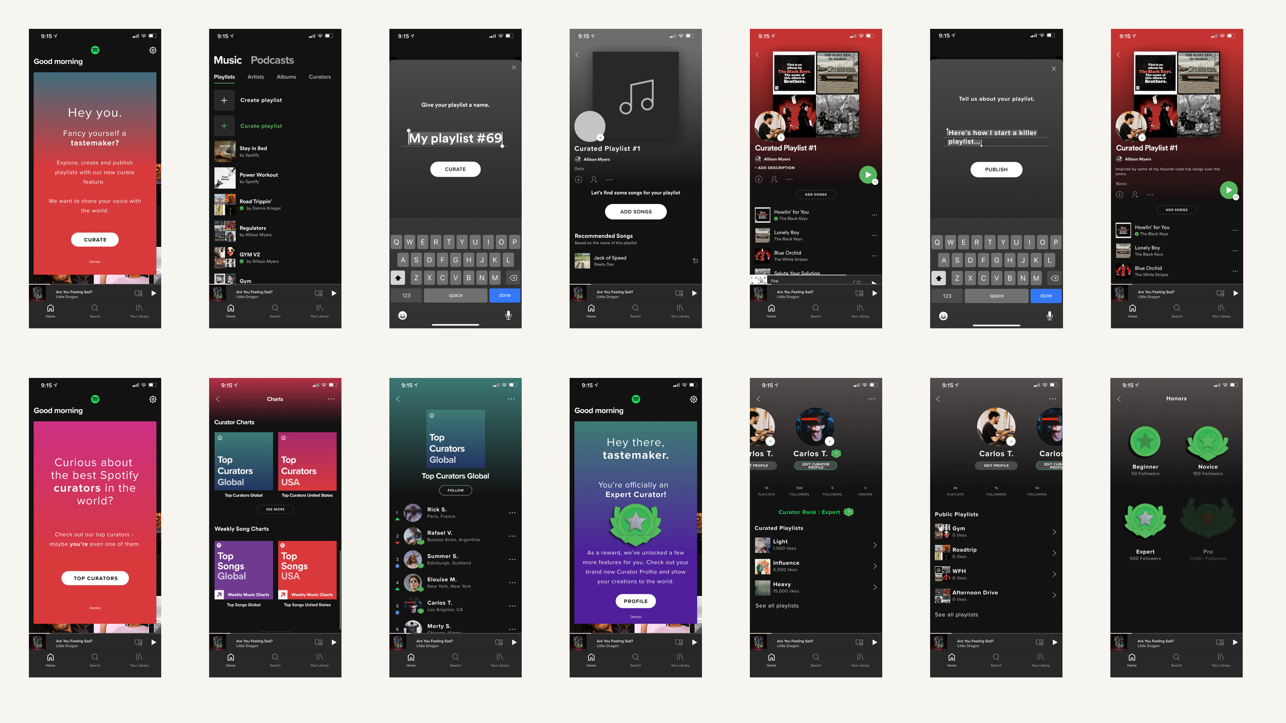
Spotify Feature
A case study for a feature addition to the Spotify mobile app.
Brief
Develop and design a feature addition to an existing product. This case study occurred over the course of 2 weeks with Designlab.
Roles
Strategy
User Research
UX/UI Design
Wireframes
Prototyping
Hi-fidelity Mockups
Background
There’s a special connection between humans and music. Perhaps this is due, in part, to the way music evokes our emotions, or maybe it’s about embodied response. It’s amazing that even with brains that are far from neurotypical, music can still break through and allow for human interaction.
Spotify wants to make a move into helping that connection further. It already has some core capabilities, like following artists or friends, and a basic feed of activity.

Research & Define
Through market, competitor and user research, I uncovered some opportunity to utilize some emotional aspects that inherently lie within the act of sharing music to create more connection for Spotify.
Personas
Lean UX Canvas
Storyboard Development
Information Architecture
To develop the IA for this feature addition, I strategized ways to nest the new pages within the already familiar interface of the Spotify mobile interface.
Sitemap
Wireframes & Prototyping
With the user journey and storyboard as a guide, I began sketching and developing the wireframes for this new task. Part of the strategy revolved around ways to make this new feature enticing - and elements such as gamification, rewards, and badges were added to the functionality.
Early Sketches
Mid-Fidelity Wireframes
Hi-Fi Design
Using the insights from the prototype and usability testing, priority revisions were developed in the hi-fidelity designs of this feature addition.
Hi-Fidelity Screens
Mockups


