Seek
A case study for a responsive travel site and blog.
Brief
Generate a responsive travel site, focused on a particular city of your choosing, over the course of 4 weeks at Designlab.
Roles
UX/UI Design
Wireframes
Hi-fidelity Pages
Background
As someone who does a lot of traveling, I find myself bouncing between several resources for any given task. I wanted to work through creating a responsive site which could provide multiple means of exploring and archiving a range of events, activities, and locations in Columbus, Ohio.

Brand Identity
After brainstorming names for the product, I landed on “Seek.” My goal was to conjure up feelings of endless exploration, and to honor individual intentions and desires. Working off of this concept, I began pulling inspiration from the idea of space to reinforce the idea of seeking and exploring.
The brand guidelines revolve around high contrast iconography, with minimal pops of color.
Logo Iterations
Brand Guidelines
Hi-Fi Design
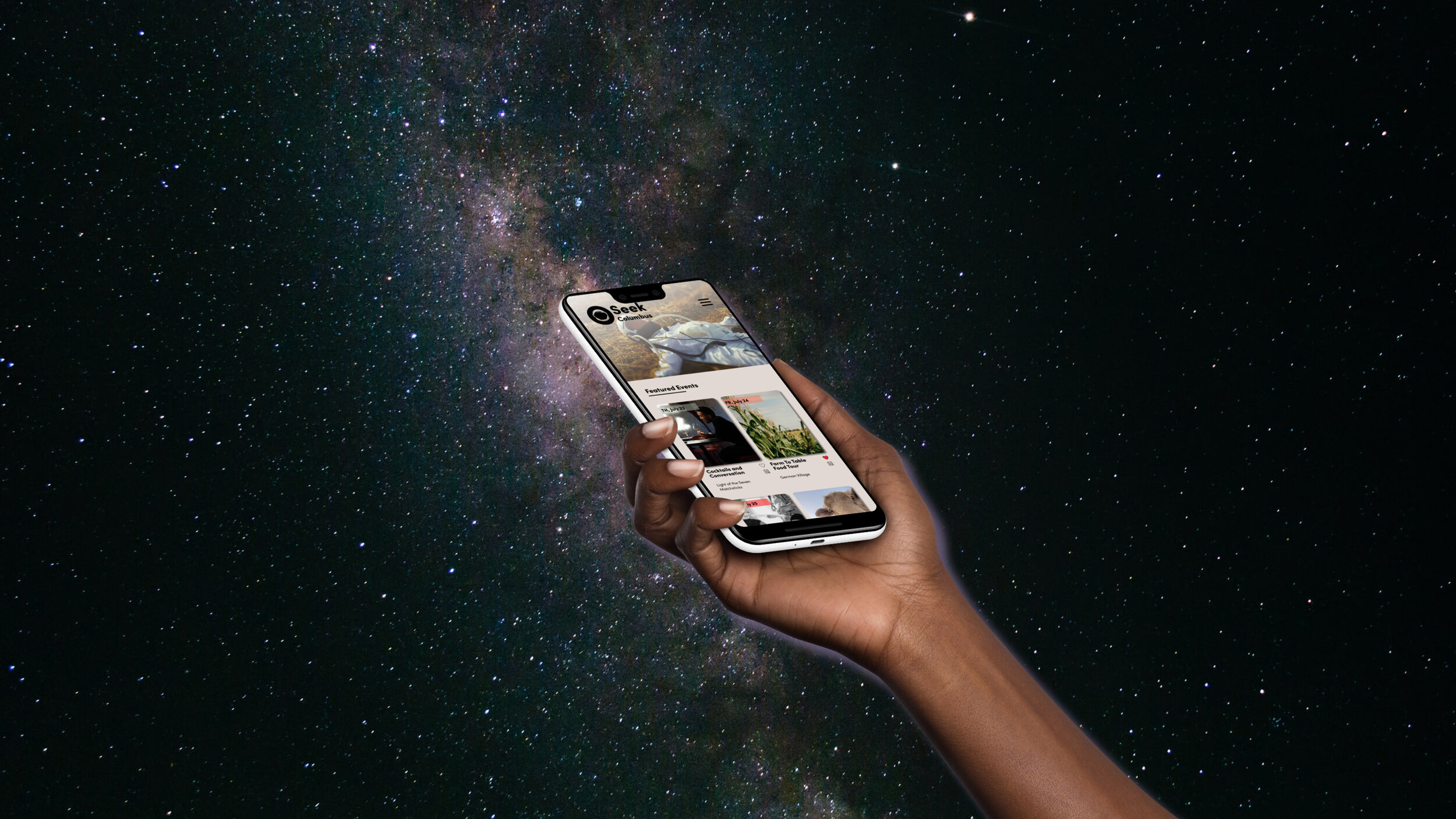
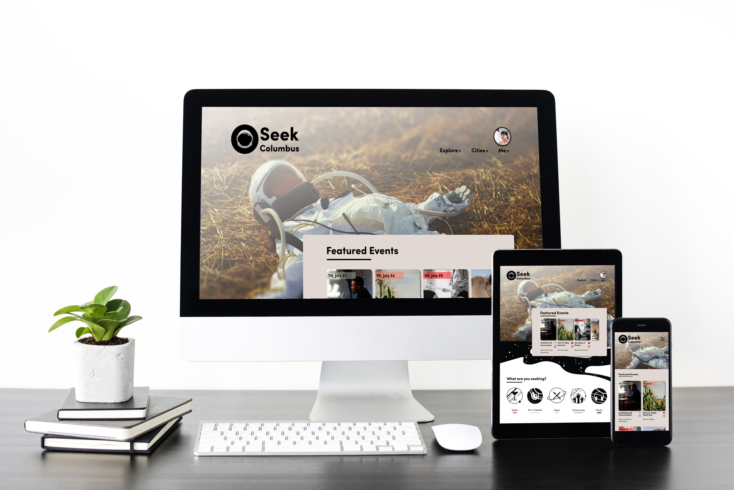
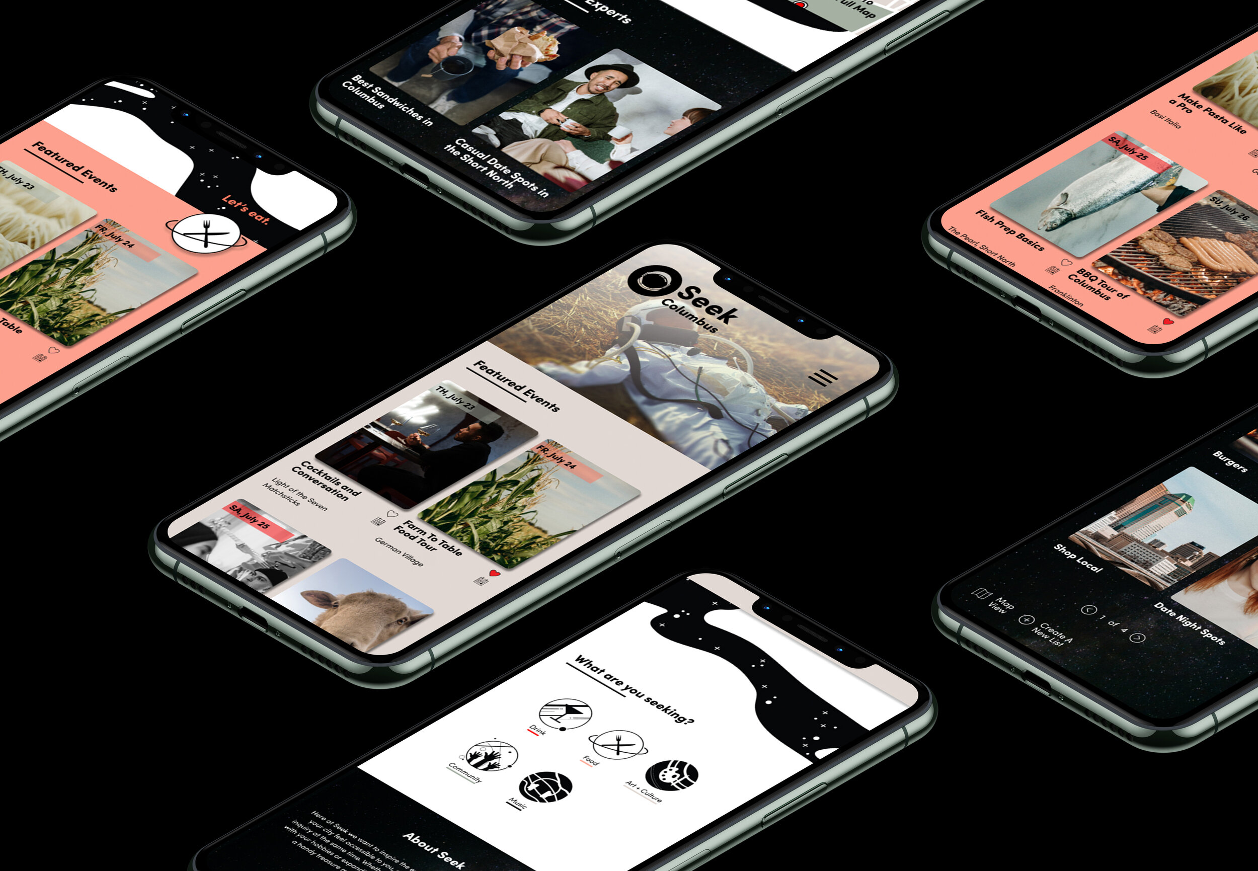
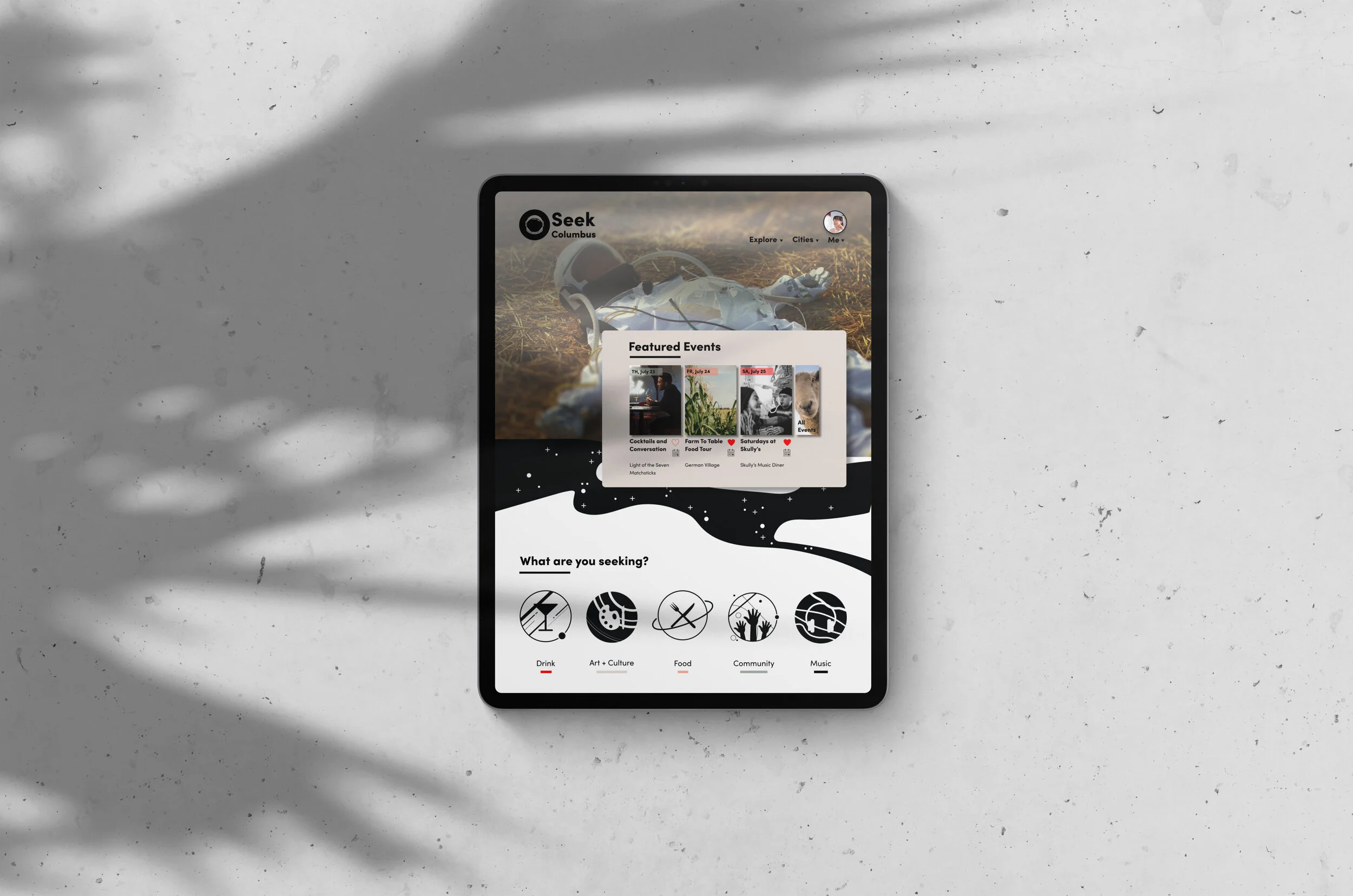
Using the my early sketches, site map, and wireframes, I generated high fidelity designs of the responsive pages.
Mockups


